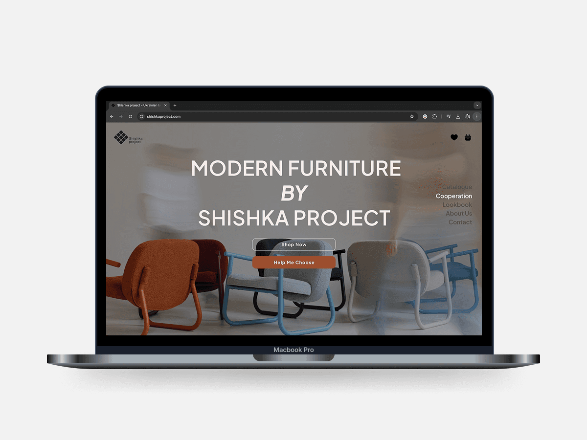
Interior Shop Website. A Marketplace Transformed
A comprehensive redesign was executed to help the company enter the EU market, boost capital, and promote Ukrainian design. The outdated website failed to reflect the brand's uniqueness and did not align with its concept. Our redesign focuses on enhancing accessibility for international users and reducing cognitive load during the furniture selection process, creating a modern, intuitive, and visually engaging shopping experience.
ISSUES IN THE OLD DESIGN
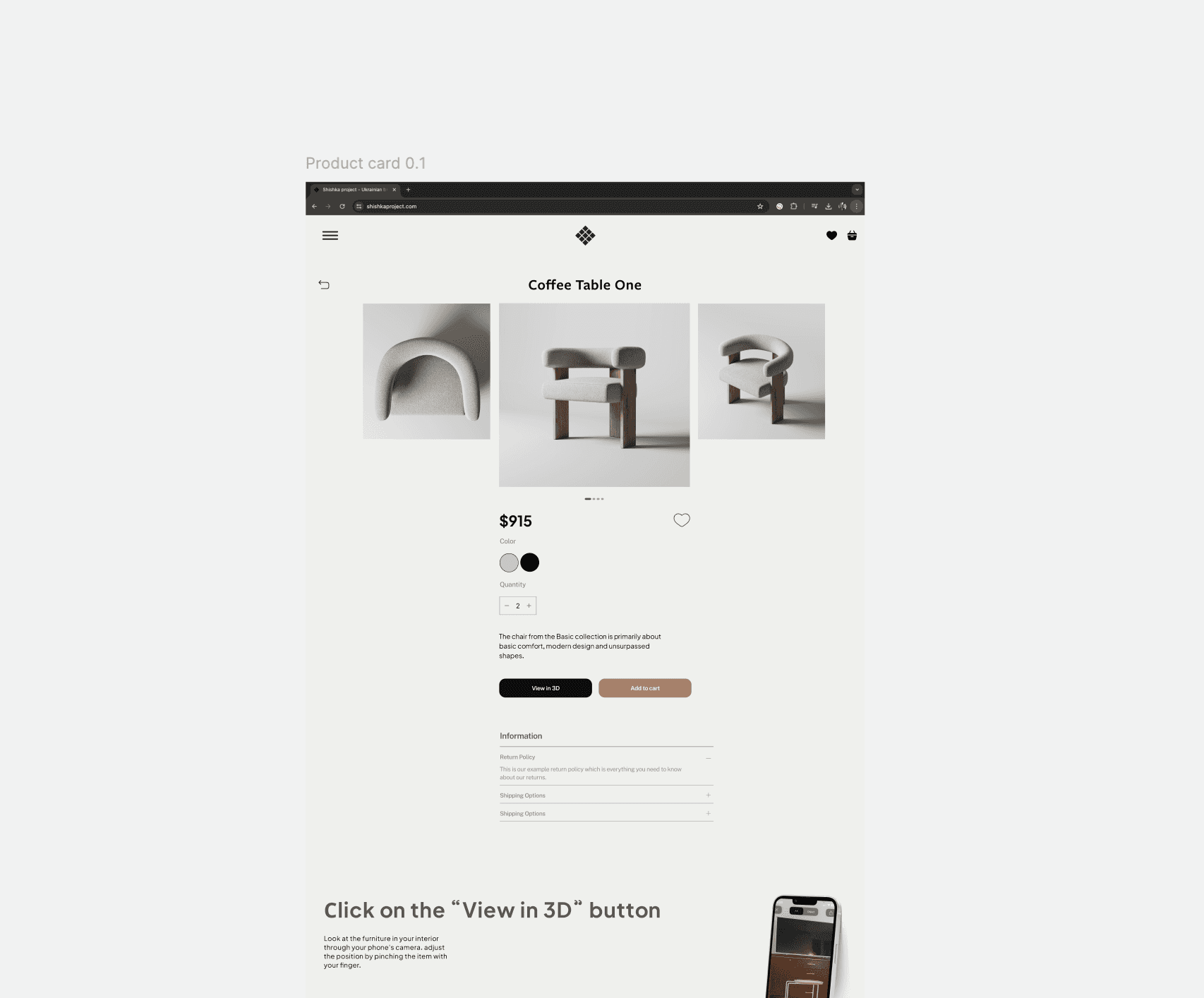
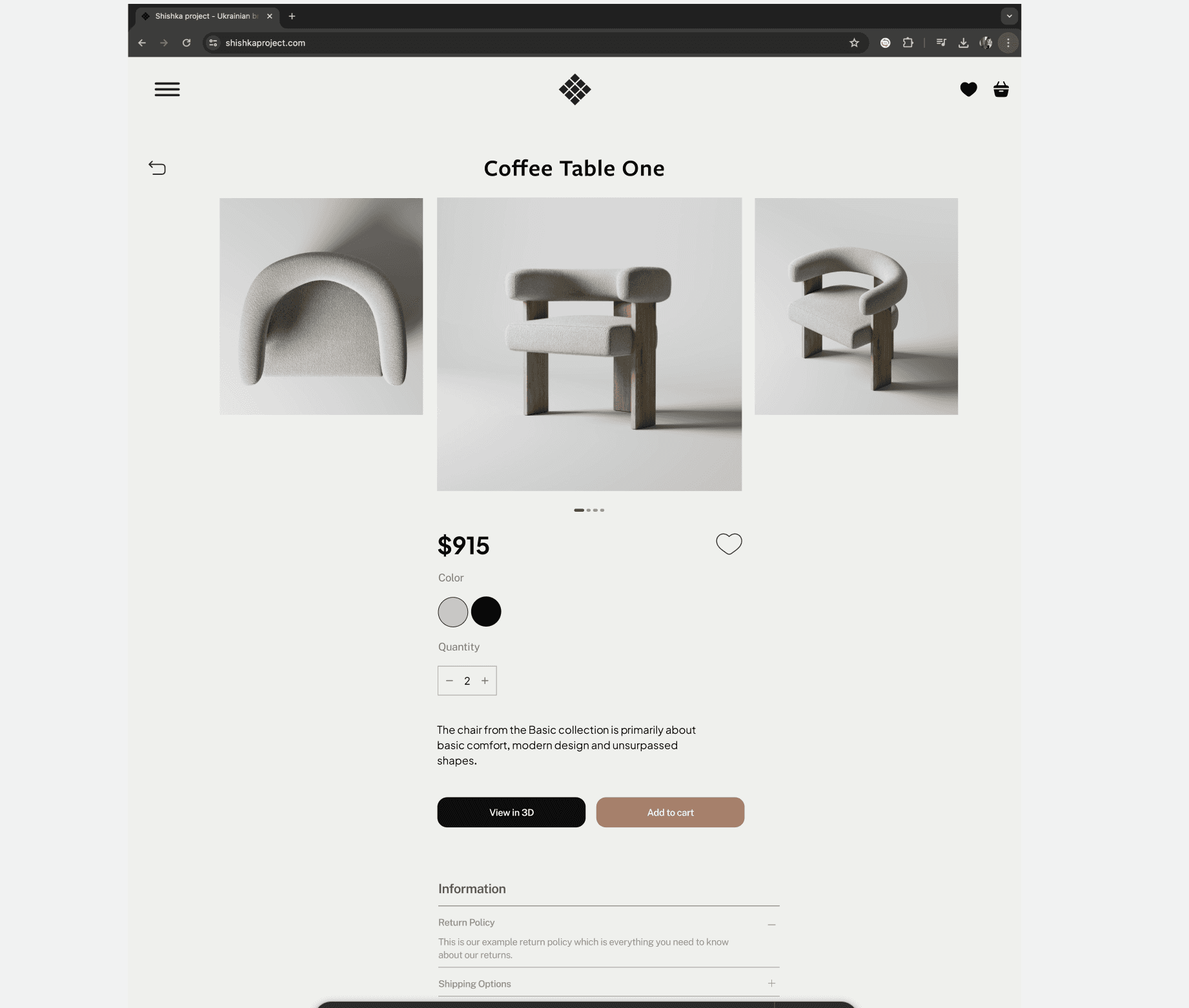
Scattered focus: Too much information on the product card without a clear hierarchy. Key details like price and availability get lost.
Weak CTA contrast: “Buy” and “Buy in 1 click” look identical, causing confusion. Differentiation by color or size is needed.
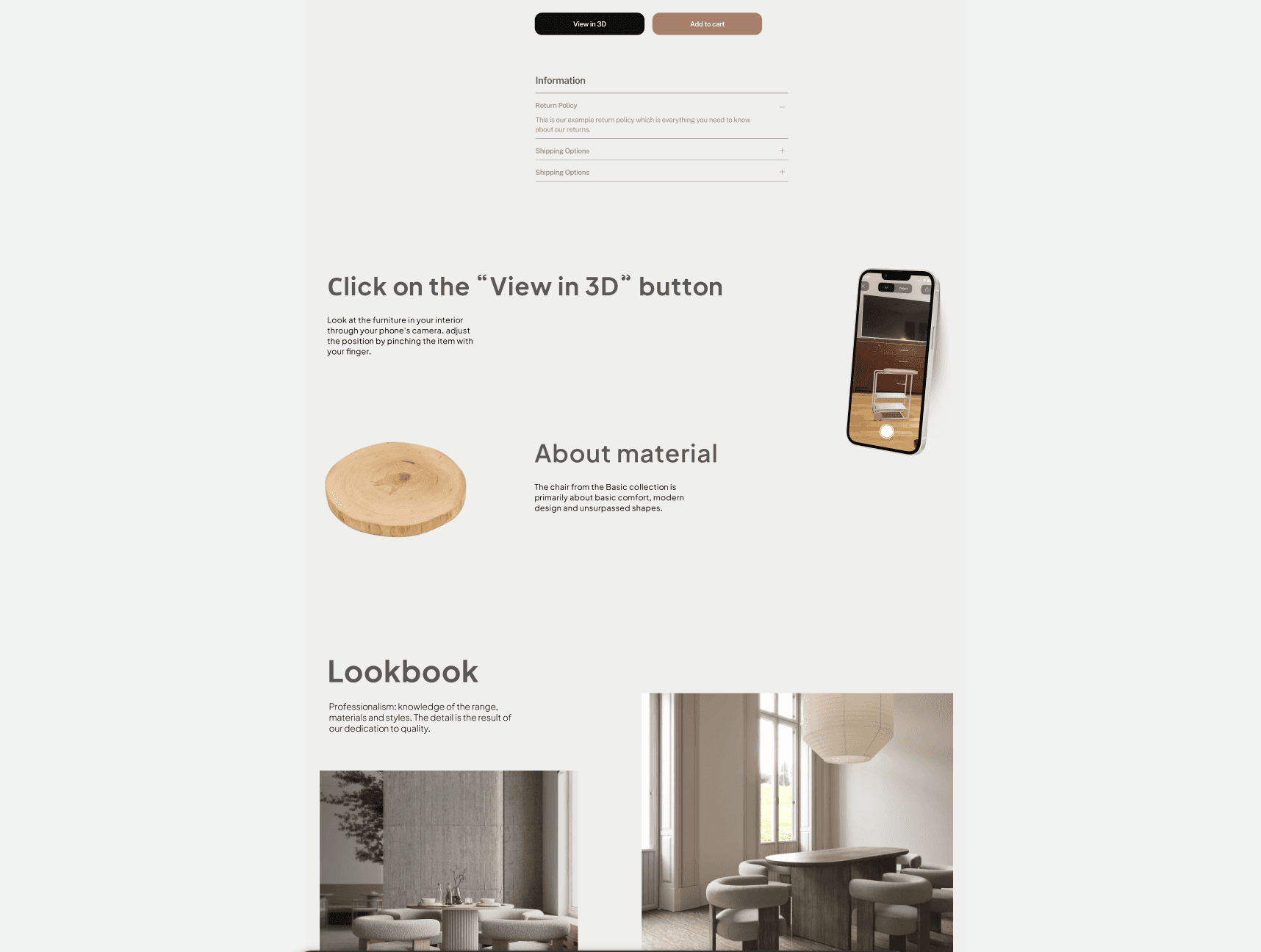
Key feature not highlighted: The "View in AR" button blends in, despite being a unique feature. It should stand out more.
Hard-to-read content: The long text description lacks structure. Subheadings and lists would improve readability.
Small images: Tiny product thumbnails make it hard to examine furniture before using 3D mode.
Elevating Trust and Experience in Furniture Shopping
KEY IMPROVEMENTS
Better Focus – Clear hierarchy highlights price, color, and quantity for easy scanning.
CTA Clarity – Distinct View in 3D and Add to Cart buttons prevent confusion.
3D Feature Highlighted – Bold black button draws attention to this unique tool.
Improved Readability – Concise text with expandable sections for extra details.
Enhanced Images – Larger visuals with a carousel for better product viewing.
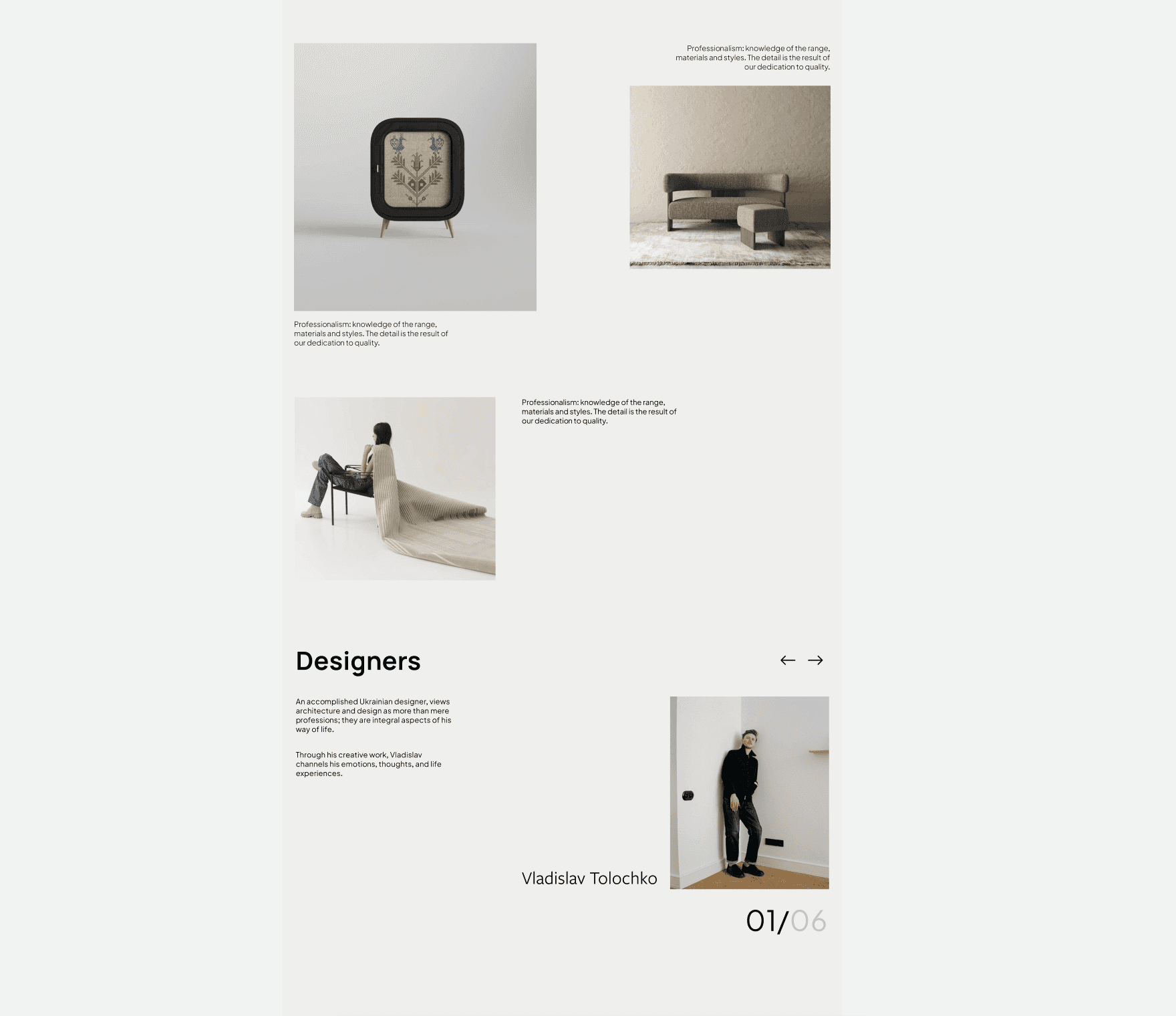
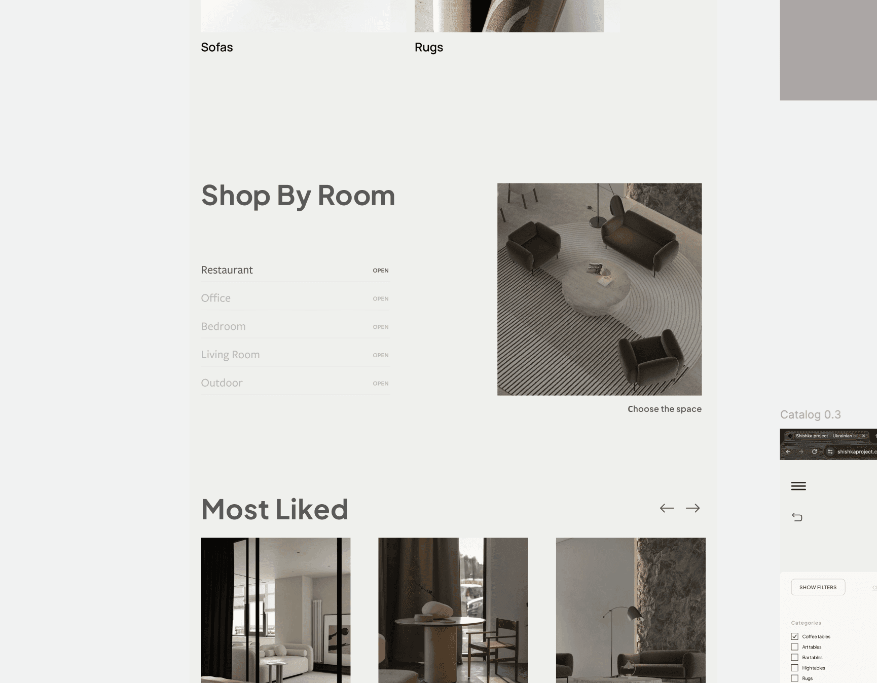
The redesign fosters trust and engagement with a focus on B2B collaboration, introducing users to the brand's story and values before showcasing products. The streamlined catalog, intuitive filters, and multi-channel communication options make navigation efficient and user-friendly, especially for European consumers. Enhancements like the 3D try-on feature offer an immersive experience, helping users make confident purchasing decisions.