Interface redesign to improve user experience
Problems with which the client approached:
1. Customers find it difficult to navigate the website
2. Many people don't understand the value of the product, such as warranty and built-in features
3. Almost no presales because people don't accessorize due to difficult navigation
Below is a screenshot of the old website.
ISSUES IN THE OLD DESIGN
Lack of clear structure: Information is presented chaotically, without a logical sequence, making it difficult to perceive.
Repetitive text: The phrases “FOR YOUR TRIP” and “CHALLENGE CHOSLY” are repeated for no apparent reason, creating confusion.
Lack of visual hierarchy: Headings and text are not properly highlighted, making it difficult to quickly scan the page.
Lack of context: It is unclear what the acronyms “TAC” and “TOUCH” mean, which can be confusing to users.
Minimalistic design: While minimalism can be effective, it appears as a flaw here as important elements such as navigation or explanations are missing.
Errors in text: Having text in different languages without translation or explanation can confuse users.
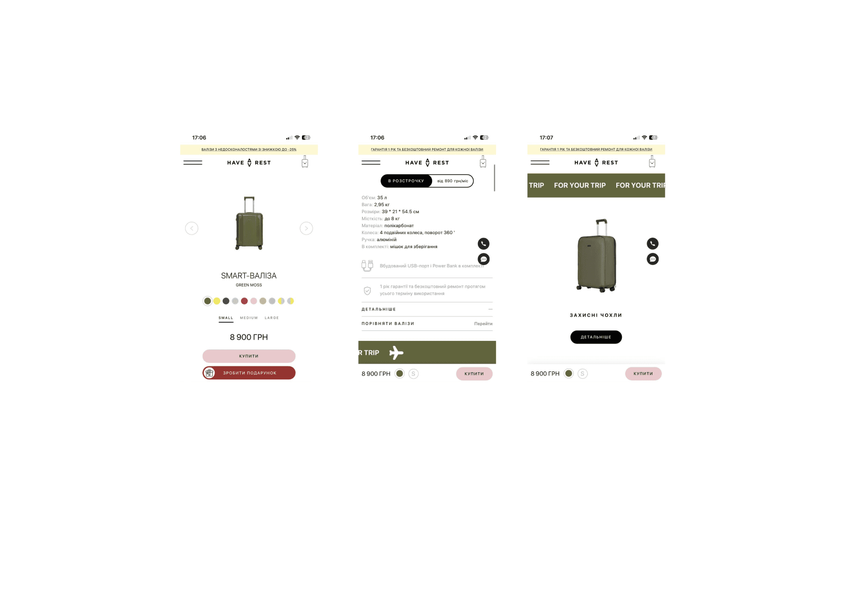
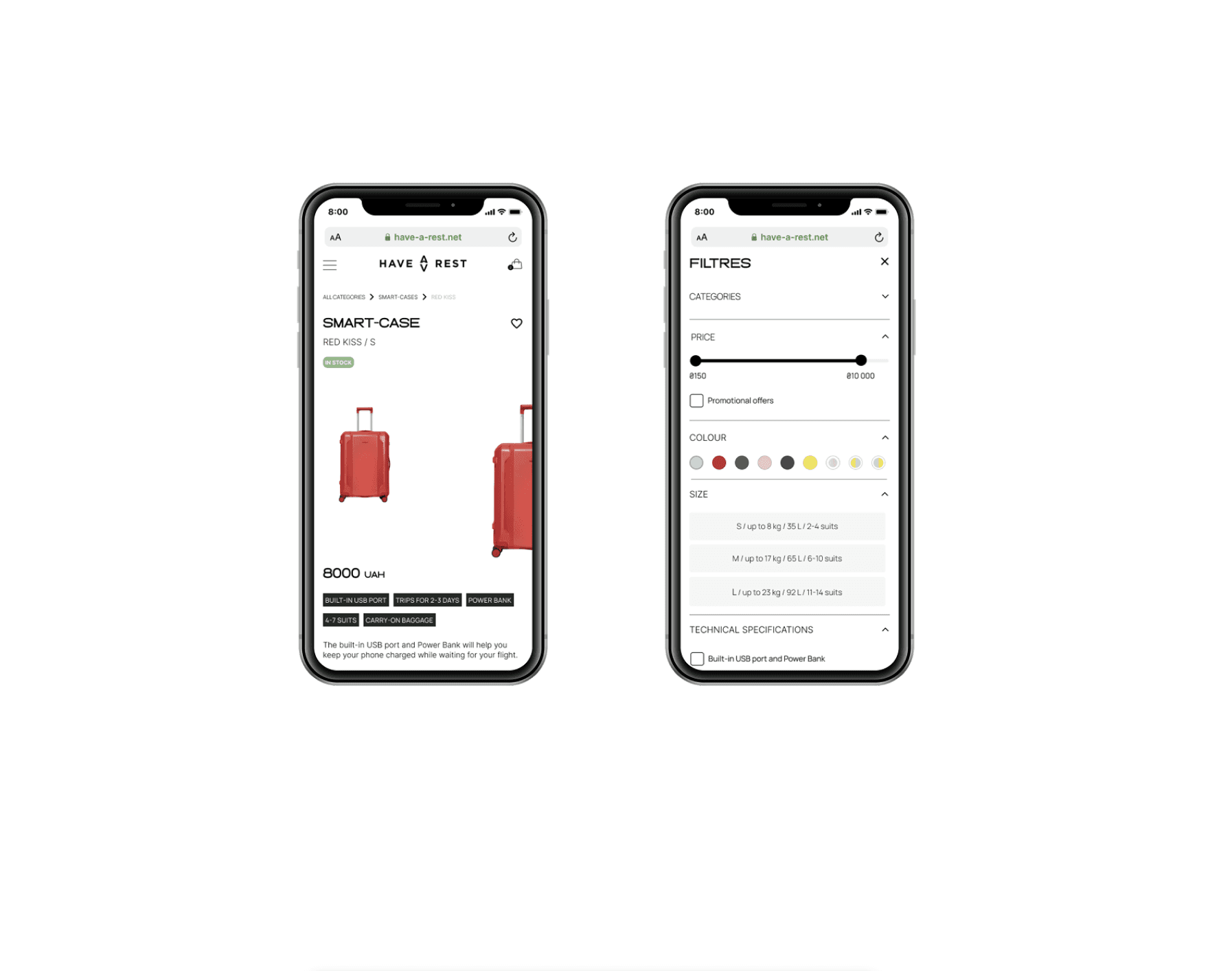
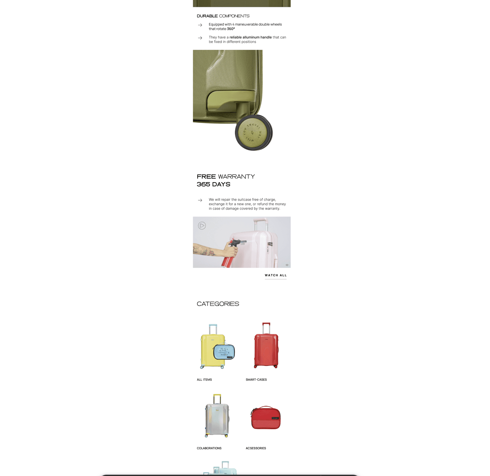
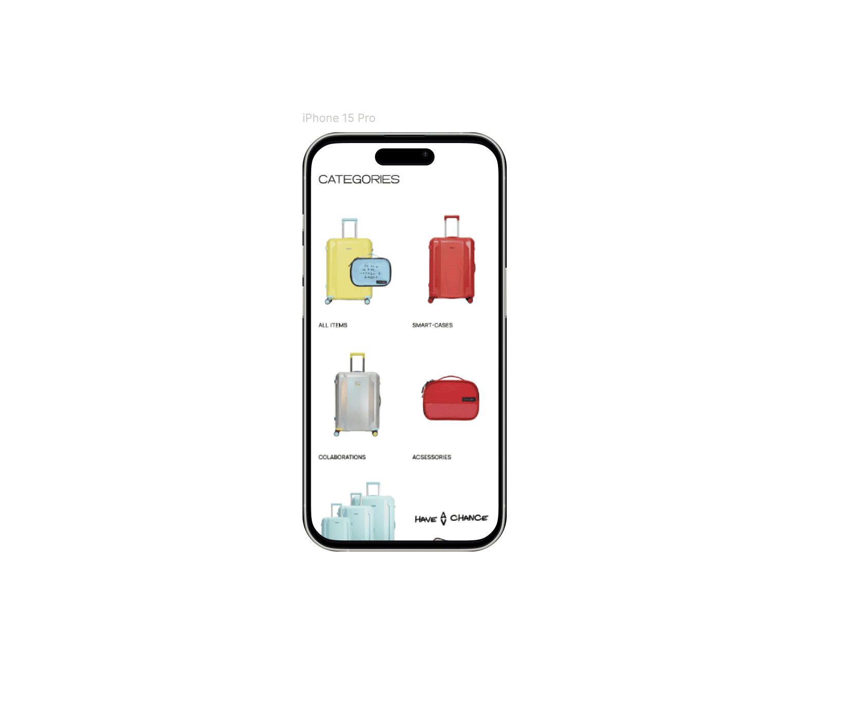
KEY IMPROVEMENTS
I implemented pagination to simplify content browsing and introduced filtering by price, color, and size to streamline product searches. Key features are now highlighted as chips, ensuring they are easily visible.
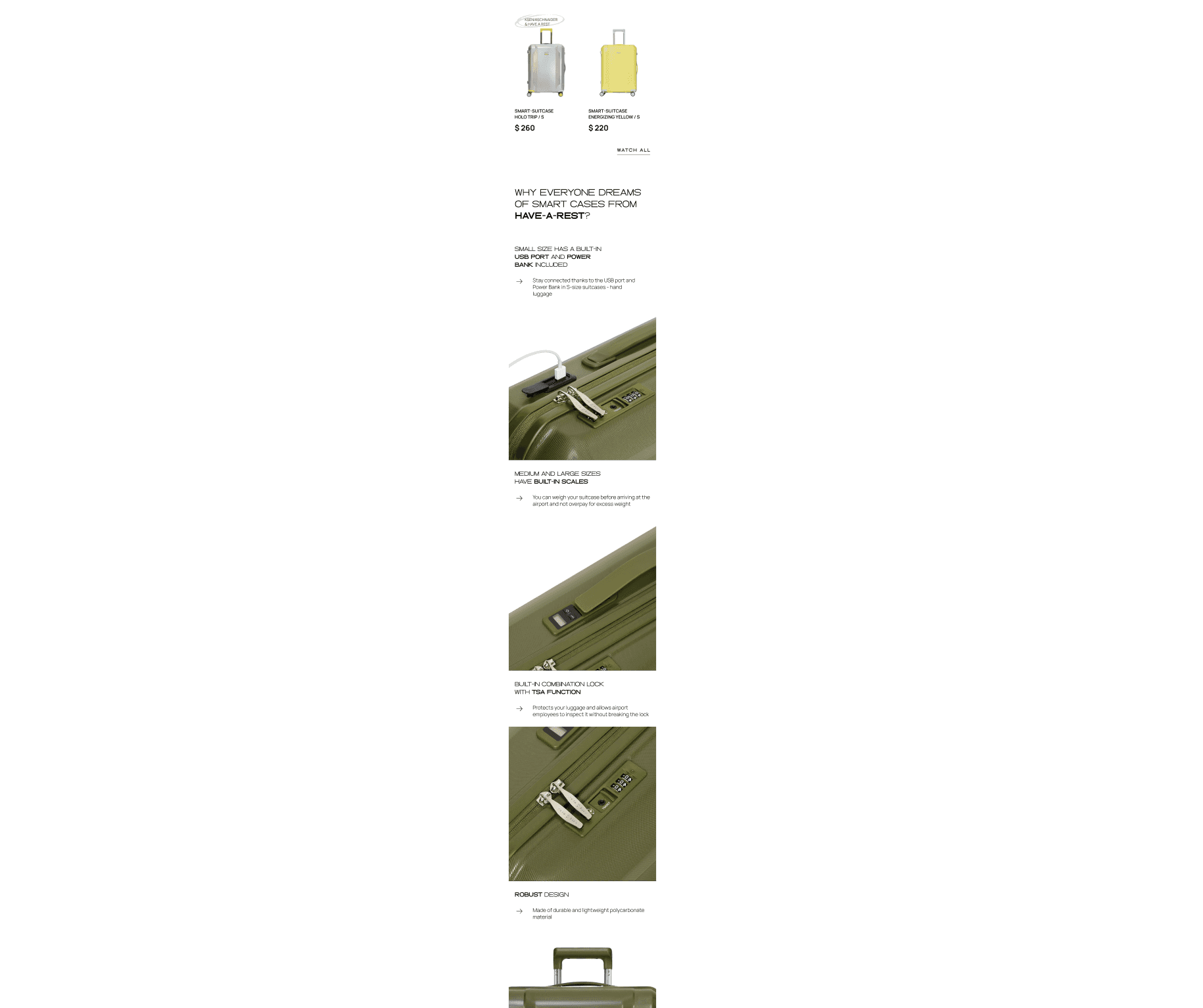
On the homepage, I showcased new arrivals prominently, followed by large images and detailed descriptions to highlight the suitcase’s advantages. Clear category sections were added to improve navigation.
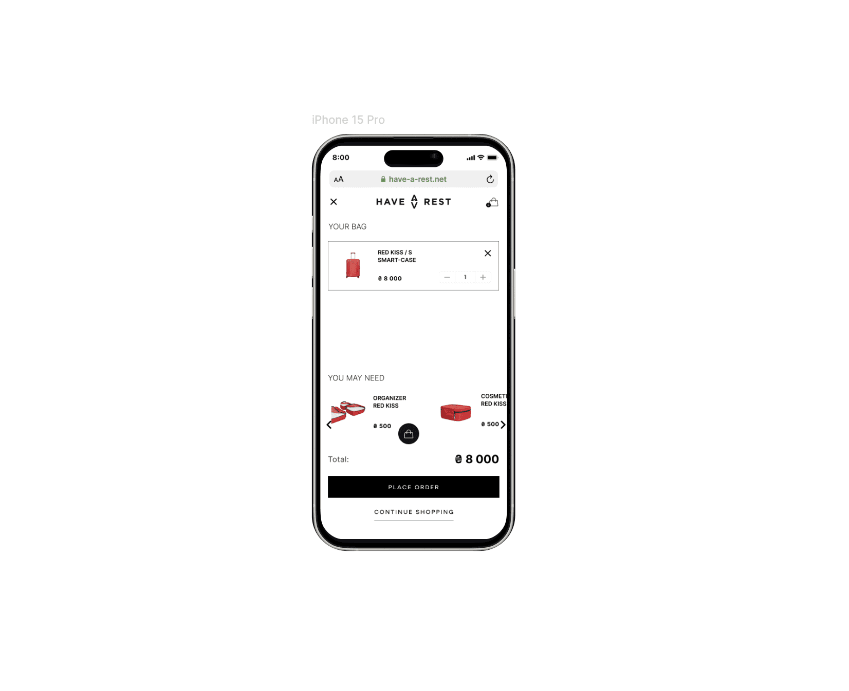
Additionally, I integrated an upselling feature in the cart, allowing users to discover complementary products before checkout.
CONCLUSION
These updates—featuring new arrivals, enhanced visuals, intuitive navigation, cart upselling, and improved filtering—have optimized usability, increased engagement, and created a more enjoyable shopping experience.